Ric Bell

Design Portfolio

Sancroft

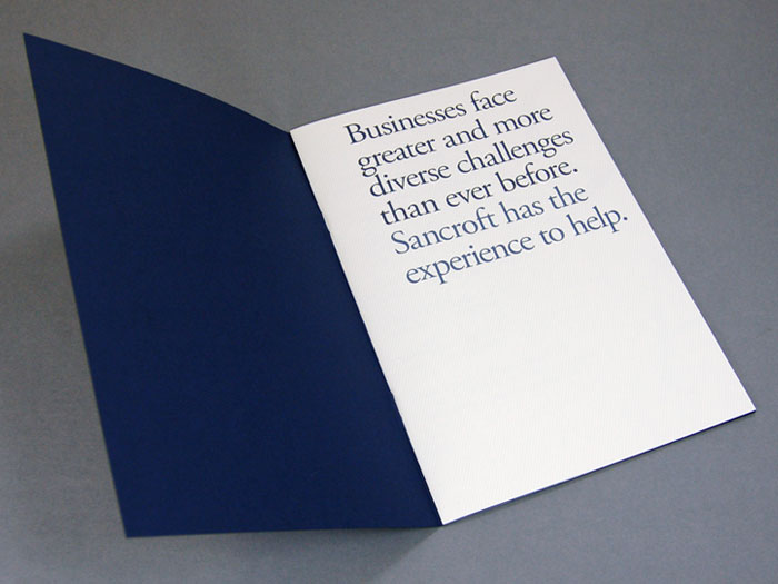
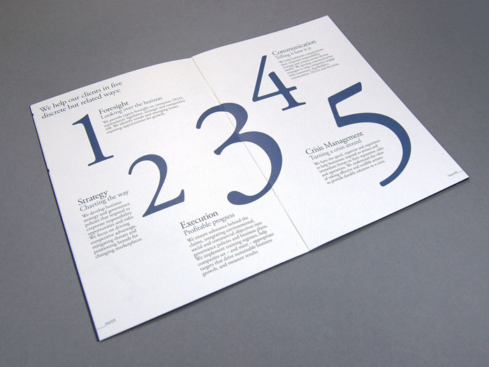
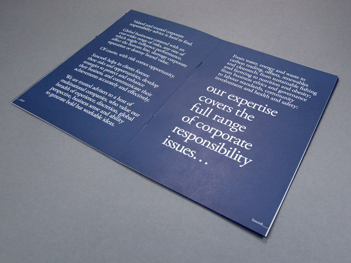
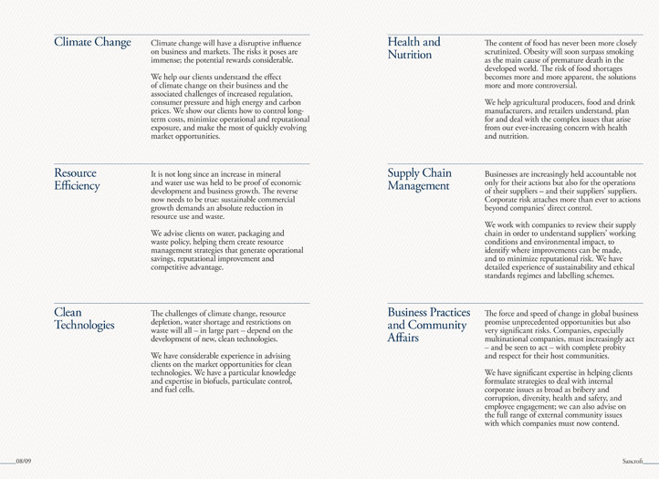
Sancroft is an international sustainability consultancy. We provide valued and trusted advice to multinational companies across the full spectrum of ethical, environmental and social issues.

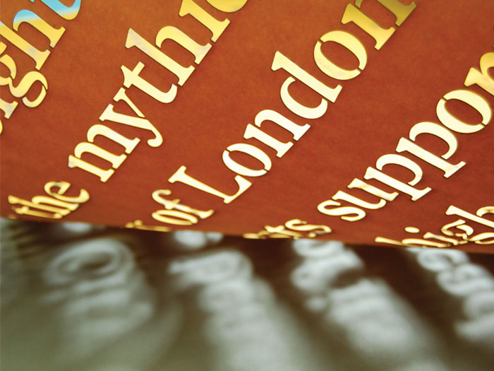
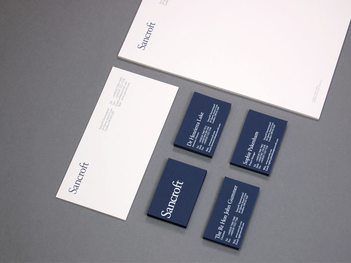
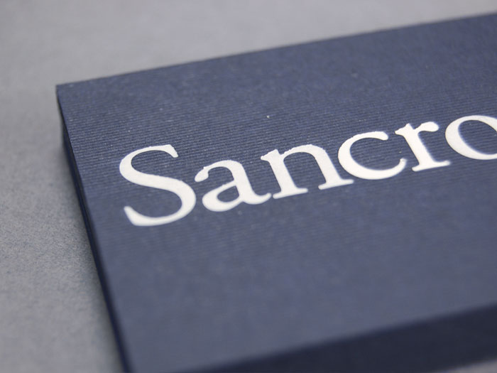
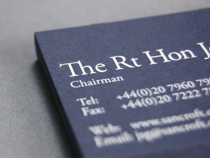
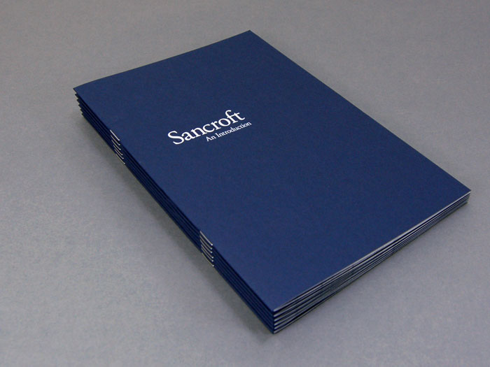
Sancroft’s stationery was designed to reflect the feel of a premiem-quality tailored suit, using textured pinstriped navy colourplan card with white foil details.

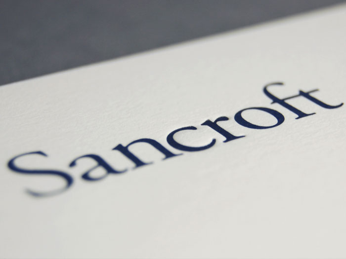
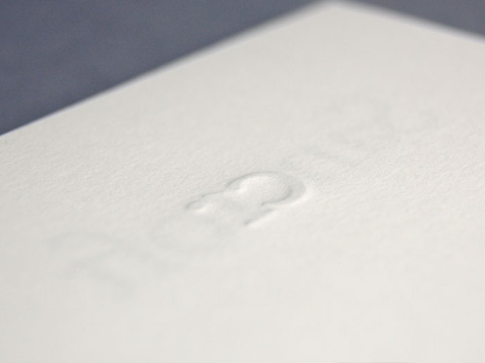
The ‘cr’ was also debossed within the logo of the letterhead to re-affirm the link with corporate responsibility; the companies main business.

Subtle typographic tweaks kept the established look and feel of the company ever-present while also updating and modernising the brand.

Designed at KentLyons.

PhonepayPlus: Annual Report 2009/10

Building on the success of the previous years’ Annual Report a more human approach to the art direction was used for the 2009/10 version. A broad range of models were cast to photograph enjoying using phone-paid services for the supporting imagery.

Using the PhonepayPlus‘ extended palette each section of the report was given its own colour, re-enforced by a bold, overlaid colour strip that housed interesting facts from the report’s research. The result was an improvement and development of the work already completed for the brand.

Designed at KentLyons.

Urban Witch

Urban Witch offers weekend yoga escapes, on-site massage and a range of workshops to relax, revive and inspire busy city minds.

An identity was required that reflected the practice of old-world principles of healing, which have been modernised for today’s market.

Within the logo characters were replaced with shapes referencing the pagan symbols for earth and fire. The logo was then embellished by Geo Law who was commissioned to produce brand illustrations which have been used extensively on company communications.

An e-commerce website was created for the client based on a WordPress content management system enabling updates to the content extremely easily.

Get London Reading

To create extra interest in the Get London Reading campaign a custom stencil font based on Plantin was created. This font was then used to create laser-cut stencils from linseed oil coated paper that could be re-used.

Using a mix of water based paints, the stencils of passages from famous books set in London were then sprayed (with the permission of the authorities) in the area the book was set in. The result was “as if the words had fallen from the pages of the book onto the streets”.

Traffic to the site went up by 1200% during the time of this cheap and effective permitted guerrilla campaign.

Designed at KentLyons.

PhonepayPlus: Annual Report 2008/09

PhonepayPlus in the real world” was the brief when creating this annual report.

Parts of the existing brand iconography were selected and re-drawn before being professionally shaped from high density modelling polystyrene. These three dimensional icons were then taken around the city and photographed to create suitable imagery for an otherwise text-heavy document.

The photographs added a well-needed burst of colour to the traditionally blue brand and the icons proved so popular with staff they now reside in the company’s HQ.

Designed at KentLyons.