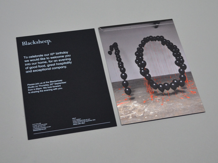
Ric Bell

Design Portfolio

BOUJIS

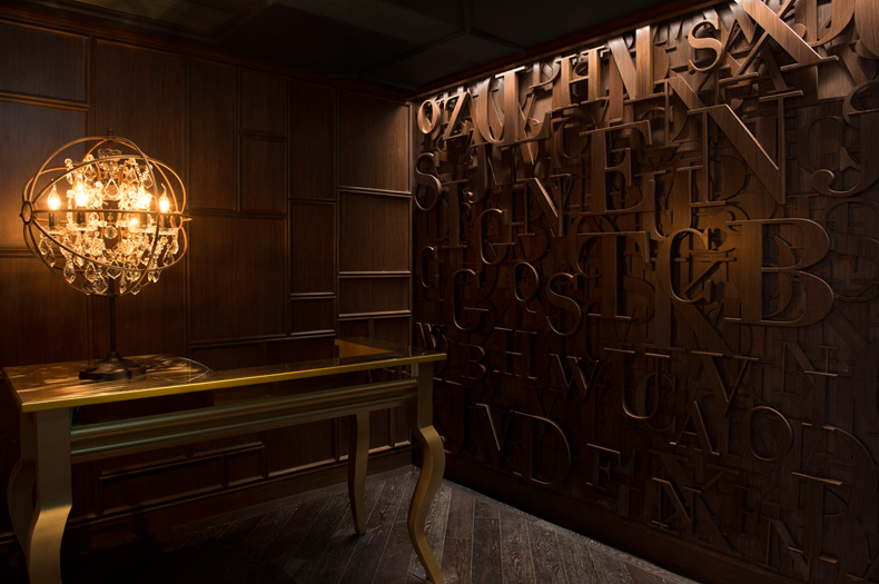
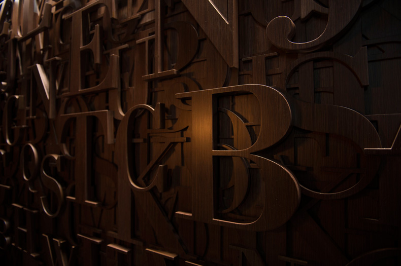
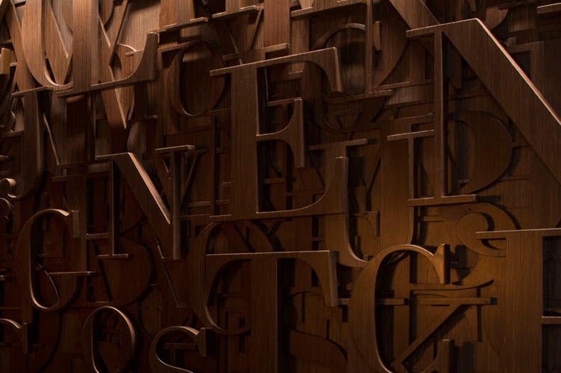
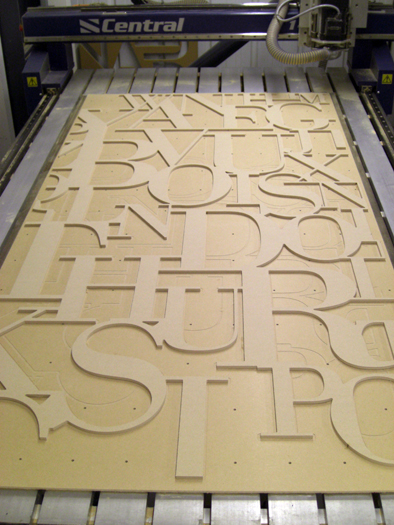
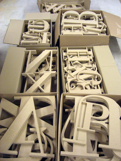
Three dimensional, layered, wooden typographic wall installation created for Boujis Members club, a premium nightlife destination in the Soho district of Hong Kong.

Working with local contractors the wall was executed to a high level of quality, finish and craftsmanship.

The wall features the brand name and address details as well as phrases associated with night clubs and bars and provides a playfully grand entrance to the exclusive space.

Designed at Blacksheep.

BAFARAT: Website & Photography

Bafarat is a Middle Eastern coffee, herb and spice company based in Jeddah, Saudi Arabia and has been handed down through family generations for over 60 years.

Sent to Saudi Arabia for 2 weeks, a series of photographs were taken in Jeddah and the capital Rhiadh with 3 days spent in the deserts living with bedouins and camel herders. All the photographs were taken using 35mm film to maintain an authentic and honest aesthetic. The trip captured the spirit and soul of the country and its people and resulted in a library of images to use across the brands communications.

A mini-site slideshow was created to build brand awareness and launch the new identity. Information about the brand appears on rollover states which change through any of the newly appointed brand colours which act as a nice contrast against the black and white photographs.

Designed at Blacksheep.
Build by Global Native.

Blacksheep: 10

Concept and photography for the promotional material to celebrate Blacksheep’s 10 year anniversary.

Black balloons and orange ribbon were used to create a localised perspective illustration depicting the companies celebration of a decade of business.

This process was also filmed to create a time lapse video which was used to promote the event online. Video can be seen here.

FIVE GUYS

Five Guys are the fastest growing restaurant in the U.S. and have been voted the #1 burger for the last 11 years running. Aiming to enter the already competitive burger market in the UK, a document pack was created to show their point of difference to prospective landlords.

With the pack proving successful and the Murrell family winning their first site in the dominant Long Acre site, supergraphics of large scale brand typography were created to explain some of the story of Five Guys to happy customers.

Designed at Blacksheep.

Secret 7″

Contribution to the Secret 7″ project for the second year running, chosen by RBPM Studio to take part as one of 10 London creative practices.

Public Enemy’s track ‘Harder Than You Think’ was selected.

The record sleeve features found photography of my grandfather and friends enjoying archery, a subtle reference to the image of a target commonly associated with the band.