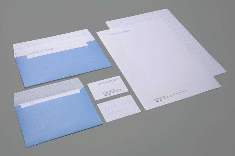
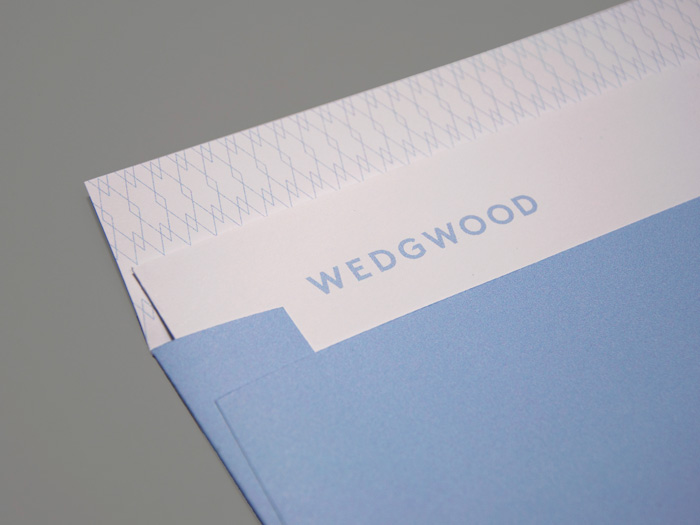
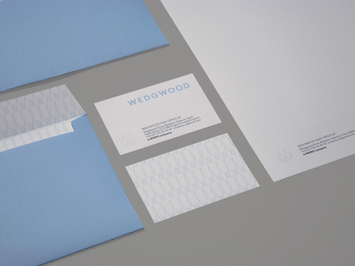
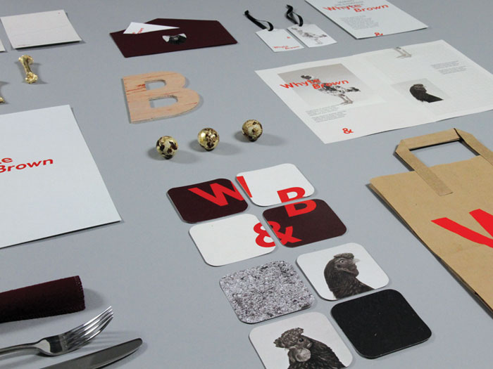
Ric Bell

Design Portfolio

Glory Glory

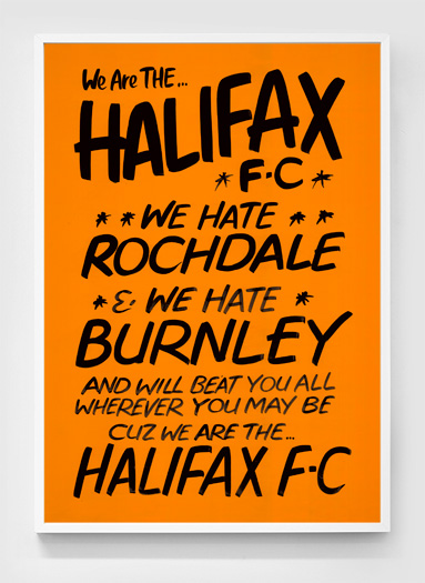
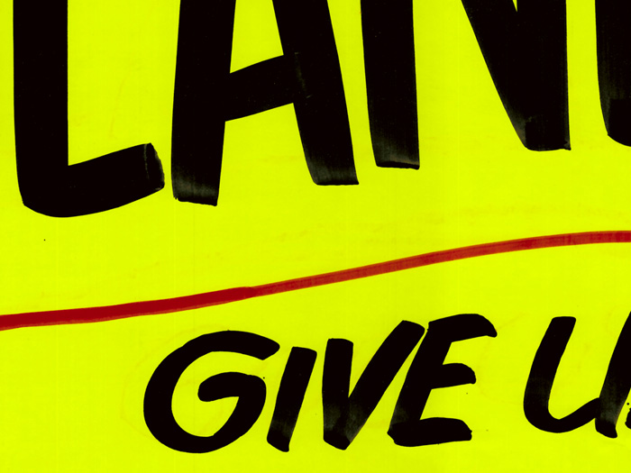
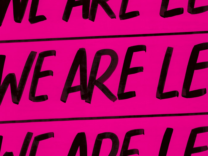
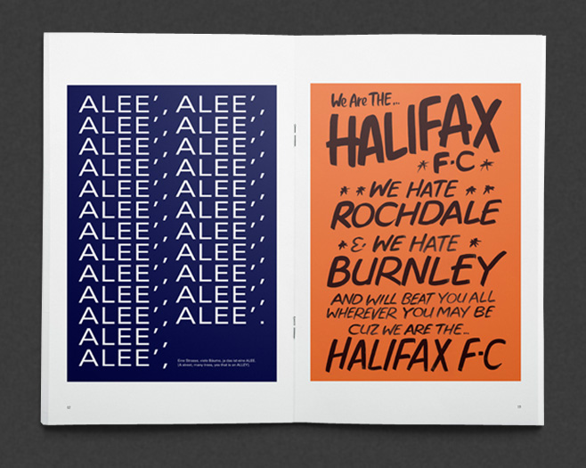
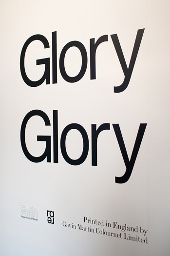
Glory Glory is an exhibition and book of large format typographic posters based on football chants, in aid of British Blind Sport.

Using the method of traditional sign painting, a set of posters were created that evoke the feeling of going to see your local towns lower league team where match day communications are often produced by the fans themselves using cheap materials.

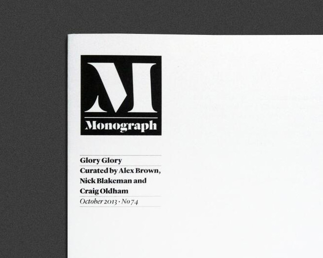
The submitted design featured in Creative Review’s Monograph publication in October.

Exhibition photographs by Sergio Jensen.

LDN

Elegance has nothing to do with money, it has to do with attitude.

Strategy, positioning, identity, collateral and environmental design for a new budget hotel concept due to open in London in 2014. LDN will challenge the expectations of low-cost hotels by having contemporary, compact yet elegant rooms with an emphasis on intuitive, uncomplicated technology.

A simple and elegant brand was created to reflect the business values using a distinctively British typeface set within a rectangular frame device. This minimal aesthetic was matched with a strong and iconic monochromatic palette and applied with an emphasis on materials and finishes.

Designed at Blacksheep.

Wedgwood

Since 1940, at its factory at Barlaston, England, Wedgwood combines modern technology with the ancient skills of throwing, modelling and decorating. Exporting all over the world with a commitment to creating premium, desirable and distinctively English home and lifestyle products to delight consumers.

A rebrand was required to proudly represent what Wedgwood stands for in the modern day. Aimed at customers and stakeholders to act as a visible assurance of the quality, reliability and performance they can expect from the company, its products and services.

The logomark was redrawn with distinguishing typographic features and the colour palette rethought inspired by the shades of ceramic used in Wedgwood products. Patterns were developed to work alongside a new range of packaging while a suite of photography was shot to reflect both the brands heritage and future facing attitude.

Pitch work created at Blacksheep.

Whyte & Brown

We’re free range chicken and eggs. We don’t mind which came first, We like them together and in any order.

Whyte & Brown is a new concept restaurant based in Kingly Court, London, that celebrates the depth and variety of meals that can be accomplished with chicken and eggs.

Putting the chickens themselves centre stage, a dynamic identity was designed with playful typography, a bright colour palette and model like photography of some of the more unusual of the species.

Pitch work created at Blacksheep.

The Decade

The Decade is a selection of ten projects that have defined Blacksheep over our first ten years of business.

The first in a series on annual Blacksheep Broadsheets this inaugural issue acts as an overview for the companies portfolio to date.

The Decade came as part of an exclusive gift bag for guests invited to the 10 year anniversary celebrations at the central London offices, with each copy hand signed by all 25 members of staff. The large format magazine was also used as a direct mailout to keep partners and suppliers up to date with the goings on of ‘The Flock’.

Thanks to GF Smith and Identity for their help with the project.